Should Light Fixtures Match Your Furniture? Does a Tonal Interior Really Look More Cohesive?

Once the furniture is chosen, lighting often raises a practical question: should the pendant match the dining table, should the floor lamp match the sofa legs, and should every metal finish repeat the cabinet handles? Matching feels safe because it reduces obvious clashes. It can also make a room look overly coordinated.
A light fixture sits in a different part of the visual field from most furniture, often against a wall or ceiling. Its colour matters, but so do its size, material, shape and the amount of contrast already present in the room.
Lighting and furniture do not need to be the same colour
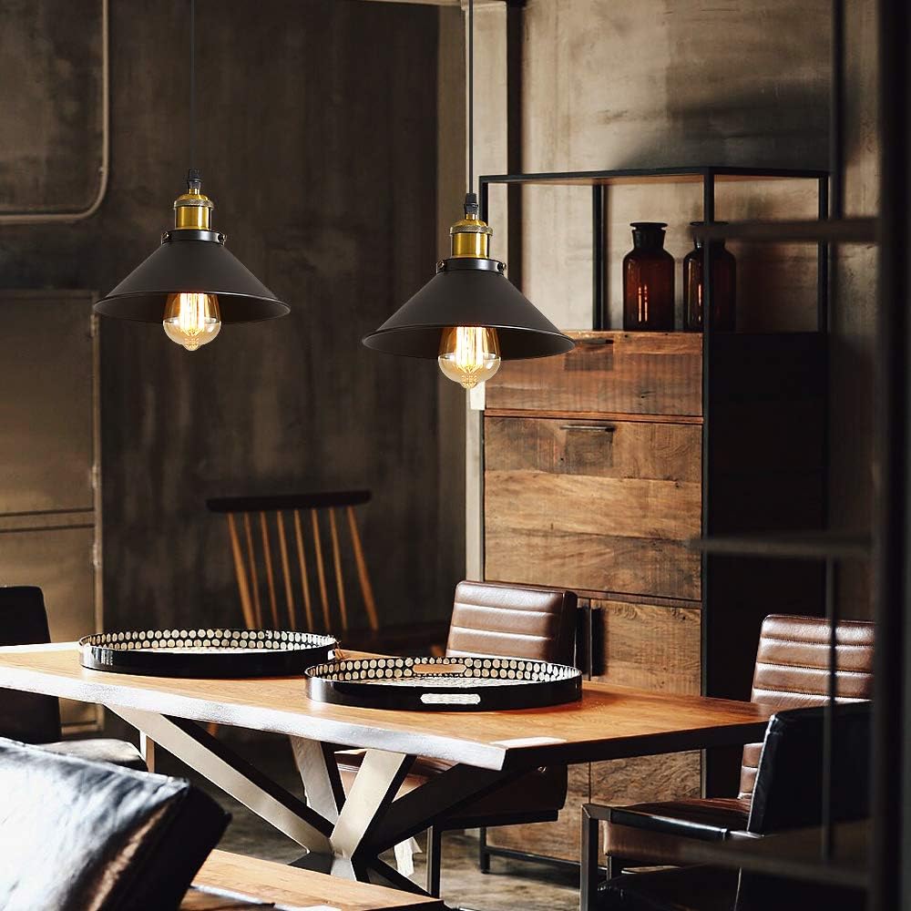
A black pendant can sit comfortably above a pale oak table. A white wall light can work beside a green cabinet. The connection may come from a smaller detail elsewhere, such as black chair legs, a picture frame or a cabinet handle.
Exact matching can be useful when you want the fixture to recede. If the sofa, rug, furniture and lighting all sit at the same colour value, the room can lose definition.
Tonal interiors work better with variation
A beige room can include cream lampshades, sand-coloured textiles, pale timber and soft brass. The palette stays warm and quiet, while the surfaces still respond differently to light.
Texture matters here. Fabric, glass, timber and metal can sit in the same colour family without becoming repetitive. Small changes in brightness and finish keep the room readable.
Contrast can make the layout easier to understand
In a very pale room, a dark pendant can anchor the dining zone. In a room filled with dark timber, a white, opal or clear glass fixture can reduce visual weight near the ceiling.
Different lighting roles can also justify different levels of contrast. A pendant above a dining table may be a focal point, while a bedside lamp or wall light can be quieter.
Look at undertones, not just colour names
Two items sold as beige may not sit well together. One may lean grey, another yellow or pink. Two different colours can look more coherent when both have warm undertones or both sit on the cooler side.
Check timber, fabrics, wall paint and metal finishes in daylight. Warm brass may relate more naturally to honey-toned wood than cool chrome does, even though neither finish matches the timber colour.
Material can create the connection instead
Clear glass works across many palettes because it allows the background to remain visible. A timber fixture can relate to flooring or a table even when the wood species and stain are different.
Metal finishes work in the same way. Repeating black, brass or chrome in two or three places is often enough to make the choice feel deliberate.
Small rooms need more restraint
In a compact room, furniture and lighting are seen at close range. A strong sofa colour, patterned rug, dark cabinets and several high-contrast fixtures can compete with one another.
Choosing lighting that sits closer to the wall, ceiling or an existing finish can calm the composition. It does not need to be identical.
Larger rooms can absorb more difference
Open-plan spaces create more distance between objects. A black dining pendant, a brass floor lamp and white wall lights can coexist when each finish has a clear place and does not appear everywhere.
The mix becomes harder to manage when every new fixture introduces another metal or accent colour.
A practical way to choose
- Identify the three or four dominant colours already in the room.
- Note the materials and metal finishes that already repeat.
- Decide whether the fixture should blend in or become a focal point.
- Compare its scale with the furniture directly below or beside it.
- Do not chase an exact colour match across different materials.
- Check the combination in daylight and again at night.
FAQ
Should a pendant be the same colour as the dining table?
No. It can repeat another finish in the room or create deliberate contrast. Scale and material often matter more than an exact colour match.
Do black lights work with timber furniture?
Yes. Black can define the edges of warm timber and looks especially intentional when it appears in a few smaller details elsewhere.
Do all light fixtures need the same metal finish?
No. Two recurring finishes are usually easy to manage. Too many unrelated metals can make a compact room feel busy.
Does a tonal scheme always look more cohesive?
It often feels calmer, but it still needs changes in texture, brightness and shape. Without those differences, the room can look flat.
How do you stop a matching scheme from looking too uniform?
Keep the colour family consistent, then vary materials, finishes and a few controlled contrasts. The lighting can support the furniture without copying it.