Why Does a Gold Light Fixture Often Look Different in Photos Than in Real Life?

Gold is one of the hardest lighting finishes to judge from a product photo. The same fixture can look warm yellow in one image, pale champagne in another and slightly brown or rose-toned once it arrives. In many cases, the fixture has not changed. The perceived colour has.
1. The lighting used in the photo changes gold immediately
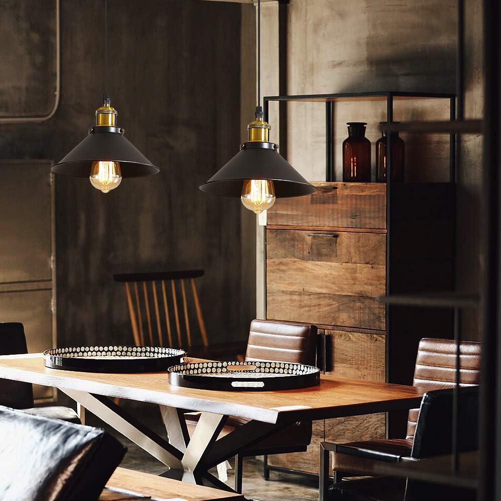
Under warm 2700K to 3000K lighting, gold looks richer, yellower and sometimes more coppery. Under neutral or cool light, the same finish may look paler, cleaner or more champagne-toned.
2. Camera white balance changes the colour
Cameras and phones automatically correct colour temperature. If white balance is too warm, gold becomes more yellow. A cooler correction can make it appear more neutral or slightly silvery.
3. Screens do not display colour the same way
Brightness, contrast and colour profiles vary between phones and monitors. A vivid display mode may boost yellow and orange. Night mode can make everything look warmer.
4. Polished and matte gold behave differently
A polished gold surface acts almost like a mirror. It reflects wall colours, timber, furniture and nearby objects. Matte or brushed gold reflects less of the room and usually looks more stable in colour.
5. “Gold” covers several different finishes
Yellow gold, champagne gold, brass, light bronze and rose gold can all be described as gold in listings. They are not the same colour.
6. The finishing process changes the tone
Painted, powder-coated, plated and anodised finishes do not produce the same depth or reflectivity. Different base materials can also shift the final appearance.
7. The fixture’s own light changes how the gold looks
A gold pendant may look fairly neutral when switched off. Turn on a 3000K source and warm reflections make the metal look more yellow. With 4000K light, it often appears cleaner and cooler.
8. Editing and 3D renders can exaggerate the difference
Catalogue images are often adjusted for exposure, contrast and mood. A 3D render may use a generic gold material that does not perfectly match the real coating.
How to judge a gold fixture more accurately
- Look at several photos of the same product.
- Compare switched-on and switched-off images.
- Look for close-up photos of the metal.
- Check whether the finish is labelled gold, champagne, brass or rose gold.
- Compare on more than one screen if colour matters.
- Look at customer photos when available.
- Use images where the gold sits next to white or grey references.
Common mistakes
- Choosing from one warm lifestyle photo.
- Assuming every “gold” finish is the same.
- Forgetting that night mode changes screen colour.
- Comparing matte and mirror-polished gold as if they were equivalent.
FAQ
Why does my gold fixture look more yellow at home?
Warm interior lighting and beige or timber surroundings can increase yellow reflections.
Does a colour difference mean the wrong product was sent?
Not necessarily. Moderate differences can come from lighting, screen calibration and surface sheen.
Which photo is most useful for judging gold?
A close-up taken under neutral light against a white or grey background is usually the most informative.
Conclusion
Gold changes appearance easily because it reflects its environment. Compare several images, check the exact finish name and judge the metal under neutral lighting rather than relying on one styled product photo.